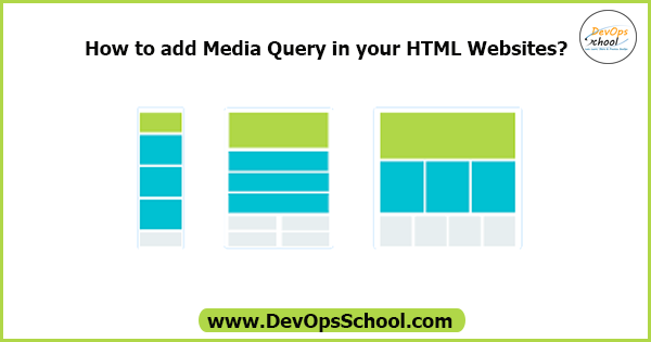
Media Query:
A media query is a CSS technique introduced in CSS. A media query consists of the optional media type and zero or more expressions that limit the style sheet’s scope by using media features, such as width, height, and color.
Syntax:
@media not only mediatype and (expressions / media features) { CSS; }Example:
@media screen and (min-width:480px){
body{
background-color: lightgreen;}
}
Use can also use these methods:
all – Used all media type devices
print – Used for printers
screen – Used for computer screen, tablets, smart-phones, etc.
speech – Used for screenreaders that “reads” the page out loud
If you use the not only operators, you must an explicit media type.
By using Logical Operators:
And:
- @media (min-width: 800px){ CSS }
- @media (min-width: 800px) and (orientation: landscape) { CSS }
- @media screen and (min-width: 800px) and (orientation: landscape) { CSS }
OR (Comma ,):
- @media (min-width: 800px), (orientation: landscape) { CSS }
Not:
- @media not all and (min-width: 800px) { CSS }
- @media not (all and (min-width: 800px)) { CSS }
- @media not screen and (color), print and (color) { CSS }
- @media (not (screen and (color))), print and (color) { CSS }
Here is the example code, you can create a html file:
| <!DOCTYPE html> | |
| <html lang="en"> | |
| <head> | |
| <meta charset="UTF-8"> | |
| <meta name="viewport" content="width=device-width, initial-scale=1.0"> | |
| <title>Media Query in CSS</title> | |
| <style> | |
| /* div { | |
| width: auto; | |
| height: 300px; | |
| background-color: pink; | |
| } | |
| p { | |
| font-size: 15px; | |
| } | |
| @media screen and (min-width: 600px) { | |
| p { font-size: 24px; font-weight: bold; } | |
| } */ | |
| body { background-color: pink;} | |
| @media screen and (min-width: 600px) | |
| { body { background-color: red; } } | |
| @media screen and (min-width: 768px) | |
| { body { background-color: blue; } } | |
| @media screen and (min-width: 992px) | |
| { body { background-color: orange; } } | |
| </style> | |
| </head> | |
| <body> | |
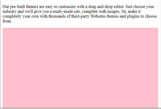
| <p>Our pre-built themes are easy to customize with a drag-and-drop editor. Just choose your industry and we'll give you a ready-made site, complete with images. Or, make it completely your own with thousands of third-party Websites themes and plugins to choose from.</p> | |
| <div></div> | |
| </body> | |
| </html> |
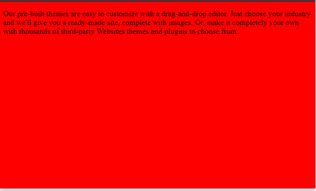
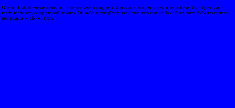
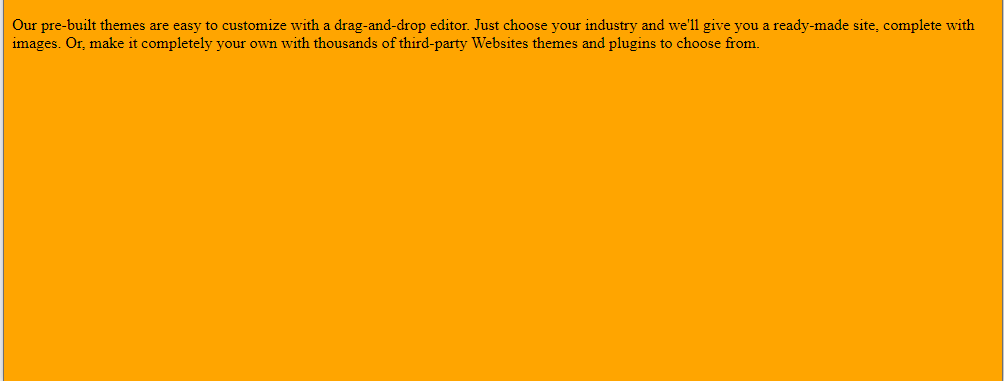
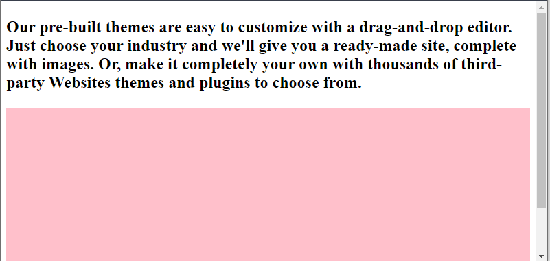
When using this CSS Code:
    body { background-color: pink;}
    @media screen and (min-width: 600px)
    { body { background-color: red; } }

    @media screen and (min-width: 768px)
    { body { background-color: blue; } }

    @media screen and (min-width: 992px)
    { body { background-color: orange; } }
Then, See the Result:
Then, using this CSS:
    div {
      width: auto;
      height: 300px;
      background-color: pink;
    }

    p {
      font-size: 15px;
    }

    @media screen and (min-width: 600px) {
      p { font-size: 24px; font-weight: bold; }
    }
See the result:
MotoShare.in provides the perfect two-wheeler for every occasion—daily commuting, weekend escapes, tourist exploration, or test-riding your dream bike. Simplify your mobility with us!